So I was involved in a music project near the end of summer called Ronette Polaski. The sound to say the least was a mashup to utilize several sub genres of alternative music including math rock, shoegaze, and jangle pop. I am proud to call this genre gangly pop as this sound is very melodic with pop sensibilities while still having a broken off kilter feel from the rhythm. Unfortunately the project is on an indefinite hiatus as most of the members are not in the same city but I'm glad we at least have salvaged this recording. I'm on guitar and vocals with Garrett Koloski on drums, Max Newland on bass, and Ray McAndrew on the controls and second guitar. Here's a link to our bandcamp with a cheap download, hopefully it will have more songs in the future.
http://ronettepolaski.bandcamp.com/track/antares
Whoots!
Saturday, December 15, 2012
Monday, December 3, 2012
Winter 2012

This piece was inspired by an act of violence I personally experienced outside of my apartment near the end of the summer. The assignment was to depict a crash so conceptually I decided to offer the the aftermath of a stabbing and segment it with the moments leading up to the incident. Drew from personal experience with an unrelated assignment that I think panned out well. The lead singer of my old band Gyaos posed for the image, http://gyaos.bandcamp.com.

Friday, September 28, 2012
Fall 2012

This piece was made for a local Haiku contest in Syracuse. It was selected as a piece to appear in the final poster printing! This was done mostly in traditional medium with the exception of scanning the text in and inverting it to white and collaging it onto the poster that was scanned in. Before the digital scans were performed, I did a light pencil drawing on Canson Illustration board and then proceeded to come in with ink (Koh I Nor dip pen with a Gallot 404 tip and Dr. Martin's Black Star Ink). I used a reference from a building in downtown Syracuse and skewed it by pushing the tower over a bit. I used light water colors, acrylic paints, and colored pencil for the color.

Memories are like sine waves. Insert from sketchbook.
Here is a newer piece that I completed in my older more Alan Cober-ish style. I completed this piece under the instruction of monster engine creator Dave Devries, here is a link to his site http://www.themonsterengine.com.

Another excerpt from my sketchbook, trying to work with negative space as a compositional aid in a similar vein to illustrators such like Jack Unruh.

Insert from latest sketchbook, applied acrylic inks and a "splatter technique" to create the textures on the lobster.

Raccoon skull studies with variations with approach to representation. Insert from my sketchbook.
Tuesday, July 24, 2012
Summer Sketchbook 2012!

Summer Sketchbook 2012 1st pg.

Insert from sketchbook.

Sketchbook Insert, German Actor Conrad Veidt.

Blas off kids?

This one reminds me of an Albrecht Durer etching.

Older Work from 2012

One of my first pieces to have ever been published through Syracuse's own Jerk Magazine. I worked within the magazine's music review section about a young hip hop artist's new EP. This was one of those occasions where an image came to me while I listened to the artist's new single "Tha Dollar". I found the rather upbeat song to have a lurking dark content about artist's selling their work for cheap commodity consumption. Overall a favorite, gave the original to an old friend.

I really enjoy drawing animals, especially within a strong pen and ink rendering they can develop this really cool lithographic look within the strong details. This rooster has a very "cool and confident" expression to it that I like.

A published piece that was used to promote within a poster for a film student's film.

Steve Buscemi!

An anthropomorphic family, I particularly enjoy the squid father's expression.

A spot drawing for Kafka's "In the Penal Colony"

An very editorial piece for "The Dancer" by Arthur Miller.

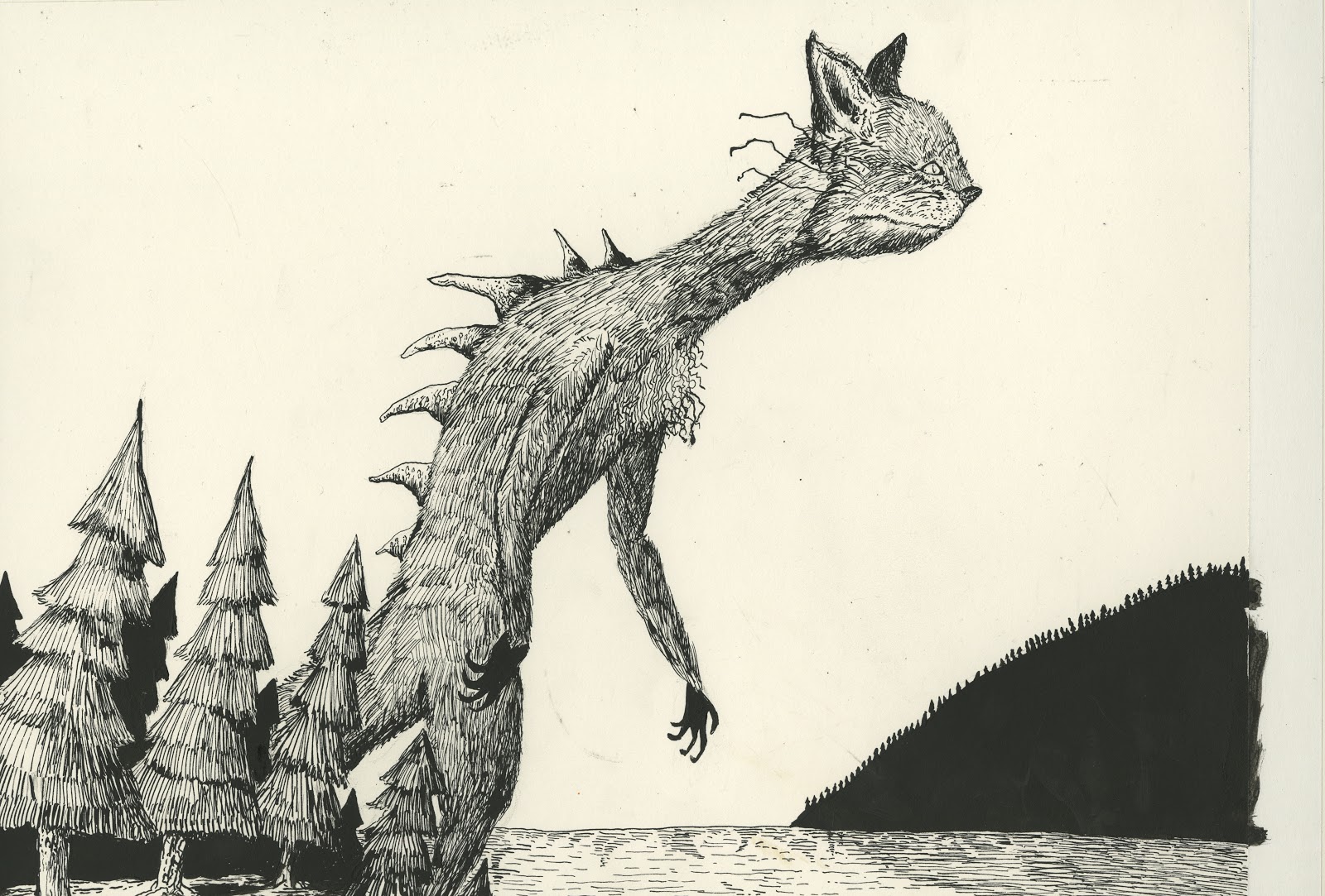
A piece that is still in the works, this was my first endeavor into utilizing a moquette for reference. This was my first "conceptual art" piece that I have done. I kind of envisioned this as an homage to the old 1950s Kaiju films I used to enjoy when I was kid. Toho Studios and Gamera would be proud.

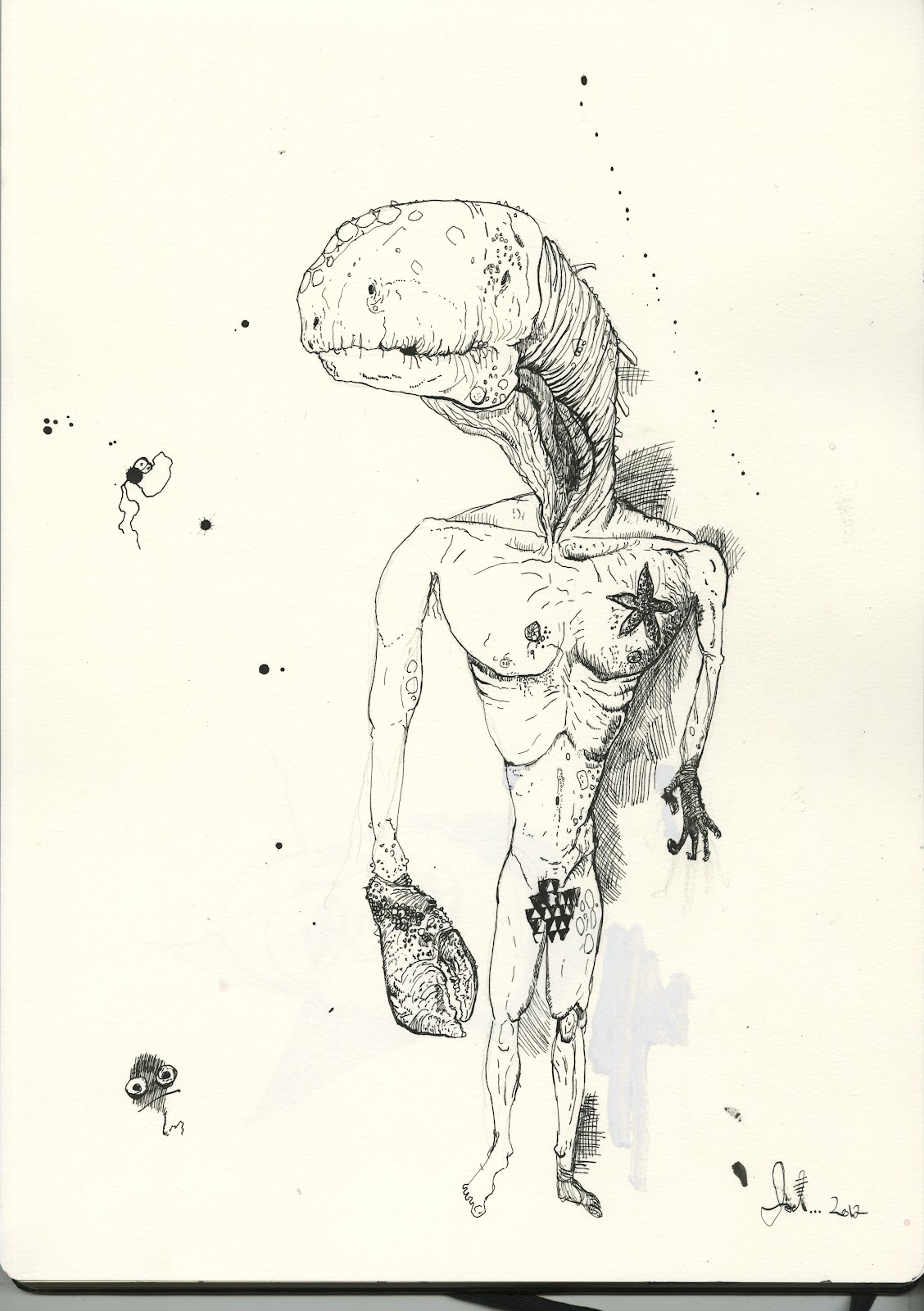
The moquette I built for reference for the piece above. I am planning on doing a series in the near future of monsters combined with old WWII machinery.
Subscribe to:
Posts (Atom)